by guest writer Harriete Estel Berman
The photographic images of your work can be like superheroes at promoting your creative business and products.

Harriete Estel Berman
They can zoom across the Internet at the speed of light, shrink to the size of a first class postal envelope, expand to super viewing size, keep working 24 hours a day, and show up in galleries, shows, homes, and offices around the world.
This is a really important concept for artists and craftspeople to embrace. All of us hope that many people will see our work in person, however, it is a near certainty that many more people can or will see the photographs of your work in print or on the Internet.
Your images can be in every library and every home in books, magazines, or the web constantly introducing your work to new audiences.
The photographic images of your work are the most powerful networking tool that you have in your possession. Yet all too often artists and craftspeople are not properly using or adequately developing this “super ability” available to everyone.
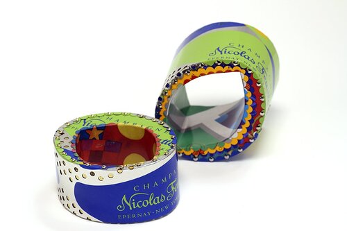
Champagne bracelets, made from recycled tin cans by Harriete Estel Berman. Photo credit: Philip Cohen
It is a false economy to think that you are saving money by taking your own photos with modest consumer level cameras lacking professional quality backgrounds, lighting, and other advanced equipment. Is there any wonder that such pedestrian images are not performing as well as hoped for? Don’t miss this fantastic opportunity to promote your work.
If you are trying to take your own photos, learn from the experts. SNAG Professional Development Seminars offered a series of lectures with tons of information that will help you take better quality images.
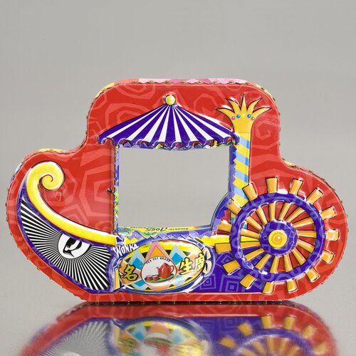
PaddleBoat Bracelet with Tea, made with
recycled tin cans by Harriete Estel Berman
Photo Credit: Philip Cohen
It is time to create your own personal superheroes!
Take a look at your images with a critical eye. This is not in the negative sense, but with the perspective of careful comparison to truly high quality images. Are the photographic images of your work achieving the high standard and visibility that you aspire for your work?
Use the two new documents in the Professional Guidelines to guide you in this evaluation. They offer concrete issues to evaluate your images. Here are a few highlights covered in this document in more detail.
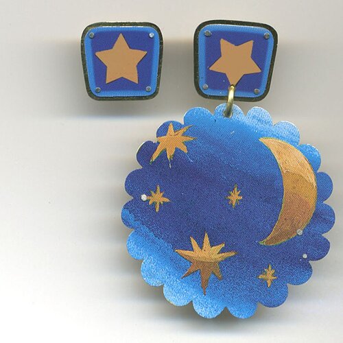
Stars and Moon earrings, recycled metal by Harriete Estel Berman. Photo credit: Phillip Cohen
Tips for Better Photos:
Start with the focus, exposure and composition of the images. Every single element needs to be exactly 100% correct and interesting. Avoid over exposure, under exposure and harsh highlights. Don’t settle for “good enough.” Just like your work, everything should be perfect.
Your photographic background should be white, grey or graduated light to dark. Avoid distracting backgrounds such as leaves, branches, logs , stones, or grass (as in this photo).
Colored, wrinkly and textured fabric or paper (as in the next photo) are not a good choice either. These stylized attempts fail almost every time because they detract from the primary purpose of the image: to have the viewer focus on your work.
Fill the entire photographic image with your work. A common problem that I see is that the object or artwork is too small within the picture plane (as in this image) or shot at an odd angle. Be bold and confident; fill the picture frame with your work.
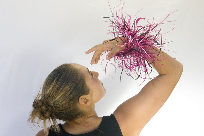
RECYCLED Fushia & Black plastic bracelet by Harriete Estel Berman, Photo Credit: Aryn Shelander
The close-up image should be memorable also. The close-up image needs to convey a ton of detail information about materials, texture, and techniques within your work. It should be like an intimate revelation of key elements that make your work special.
Take time to evaluate your photos objectively and constructively. Get in-depth, analytical opinions from friends, colleagues or your Critique Group. Don’t let them give you a polite passing comment. Really dig deep and evaluate the elements of the image.
If you have examples of good and bad photo comparisons that you are willing to share, please send them to me for a new Professional Guidelines document with photographic examples.
Harriete Estel Berman is an artist, metalsmith and advocate utilizing recycled materials in her work that addresses cultural issues and political hot buttons.


great advice! photos of our artwork can be a powerful way to share and build our brand.
For upcoming art shows, I have tried to choose one image not only for use on the web but also to have the digital image ready to send to media outlets if they request them.
Also in the “real world” I suggest having your “iconic image” printed on the back of business cards and postcards. So when you meet someone – instead of just saying you’re an artist, you can hand them something that shows what you do. Images can be much more powerful than words.
David, That’s a great way to represent your work, and I’ve seen some arresting business cards that had a “wow” image on them that worked really well, as you mentioned.. You are branding yourself with your iconic image, which is a smart strategy as well.
Check out Harriete’s blog for fantastic detailed posts on all aspects of photography.
I agree ~ great tips! I have worked hard to take better photos of my work for my Etsy shop. There is always room for improvement and it’s fun to learn new techniques! 🙂