By Carolyn Edlund
Is your website really showing your art to its best advantage?
I regularly review artist’s websites, and have visited thousands of them in the past few years. There is a huge disparity in online portfolios. It isn’t hard to tell who is serious, and who is not.
Are you truly proud of the portfolio you are presenting to the public? If your website images could use some help, check out this list for ways to make some improvements.
1. Make your collection cohesive. Is the work on your website in a mature signature style which is distinctively your own? It should all look like it was created by the same artist. Working in drastically different styles and mediums and presenting a mishmash of them on your website can make you look like you’re not sure what you want to do, or are an amateur.
2. Selectively remove images. Are you showing primarily one style or medium, and have a piece or two included that really don’t fit? Your brand is more memorable when you make one statement which is consistent. Plus, a critical appraisal of your overall body of work will be affected by the least successful piece in your portfolio. Take a hard critical look at the images on your site (or get a second opinion) and pull out those images that are the weakest.
3. Show current work. If the last time you updated your online portfolio was a year or two ago, it’s out of date. Have photos made on a regular basis to keep your website fresh and present your most exciting new work.
4. Don’t compromise on the photography. The images of your work are the most important way you communicate to others about yourself and your art, and your level of professionalism. If your photos are dark, blurry, or amateurish, it speaks volumes. I’ve heard all kinds of excuses from artists as to why they don’t have really excellent photos taken of their work. What they don’t realize is how many opportunities they are losing because of poor quality photos. I jury artists quite a few times a year, and consider photo quality to be paramount. A wonderful piece of art which is poorly photographed is rejected. Every time.
5. Lead with your strengths. When visiting your website, the first word out of the viewer’s mouth should be “Wow!” Show your best images right out of the box – don’t expect website visitors to click through boring pages to get to the good stuff. Knock their socks off, and invite them in.
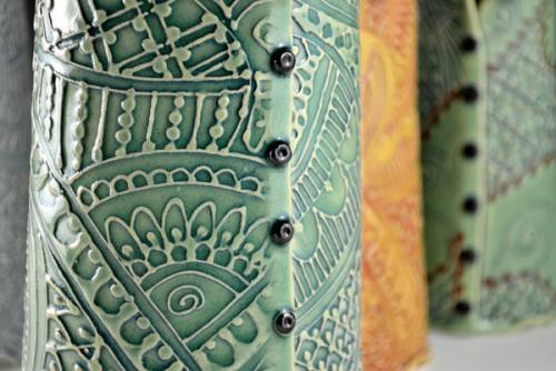
6. Enable a closer view. You have great photos on your site. But can they be enlarged for a close-up view? This is a must. Nothing but thumbnail shots is almost heartbreaking. Make sure you also have detail photos of art to show intricate surfaces.
7. Show more views, especially of 3D work. The more chances you give the viewer to get a really good look at your work from different angles, the better they can “experience” your artwork.
8. Show in context. Photos of your art in an interior setting help others to visualize it better. Use models for jewelry and wearables. Photos can also show scale and context, so that visitors can imagine owning your work.
Artwork courtesy of Kathy King and Charan Sachar.


As always Carolyn, this is fantastic advice. I’m gradually implementing these strategies now that I’ve found an artistic style I enjoy working in.
Great points! Does Artsy Shark offer website portfolio reviews? Just curious! 🙂
Yes! Artsy Shark just launched a personalized website review & evaluation package, at introductory pricing through July 15th. Check it out here http://bit.ly/1611hZq
very effective guidelines, helpful to have artsy shark hammering that in, thanks carolyn!
i am also gradually implementing these guidelines (as alison does) and although i have had a web presence for decades now, i am always refining and tending to details… just like in my work.
the two do go together!
Sharing in First Night Design Times: http://ow.ly/m0vHg
Thank you, Carolyn, for the great advice. It’s very helpful and your article was really interesting to read!
Every step is so important. Especially admire the courage of #2. Selectively remove images… a discerning eye is crucial! We can get amazing perspective by doing and improving and listening to the insights of others.. ~Thank YOU Carolyn.
Kara, An artist and teacher once stated, “Your portfolio is judged by your worst piece of work” and I think he was correct!
Thanks Carolyn for this informative post, what we realize but hardly act upon, now has come forward by this post.Thanks, I love your posts
Take Care and All the Best!
Dear Carolyn,
hello
kindly spare some time to view my site …
Regards
madan lal
Great information! A good portfolio is very helpful for job seekers because it shows the output of your work.
Great advice. Thank you for your insight.