by Carolyn Edlund
Does your art website Home page need greater impact? Try these tips.

Keep it simple.
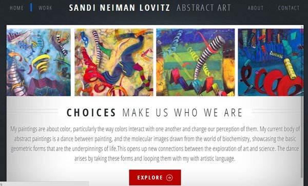
Don’t confuse your website guests with too much clutter or distraction. Check out the home page of artist Sandi Neiman Lovitz’s website (below) which features a cohesive group of her paintings, a simple navigation bar, and her artist statement. Her “Explore” button in bright red is irresistible and leads to her portfolio.
Go big and bold.
Want to make your work really pop so your visitors yearn to see more? Try splashing an exquisite detail of your art across your entire home page as eye candy. A perfect example of this is the website of artist Lisa Goesling, whose site is bold and inviting. Her home page becomes almost a work of art in itself.
Use color to set the mood.
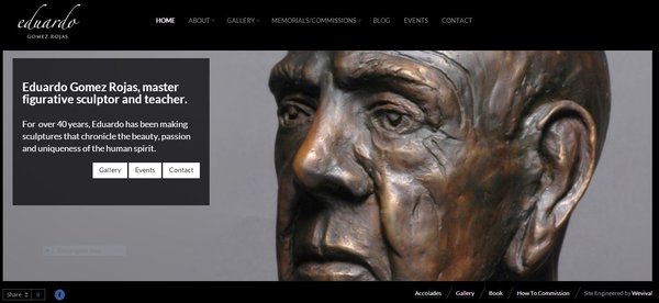
Eduardo Gomez is a sculptor with serious subject matter and a higher-end clientele. His website (below) is framed in elegant black, which is the perfect backdrop to show off images of his work. Is your work dramatic, whimsical, or humorous? Use colors to help tell your story and set the stage for your own portfolio.

Invite your visitors in.
Address your readers directly, and acknowledge them. Potter Ira Burhans Home page says “My current work is made with stoneware clay. I want my pottery to become part of your everyday life.” This is a terrific way to engage your website guests by acknowledging them, being straightforward, and drawing them in for more.
Be up front with your message.
Don’t leave your visitors guessing. Instead, make a clear statement that tells what you do. You may even want to identify your market. Check out Paw Palettes, which is all about the art of the dog, with gift items ready to be shopped. It’s very easy to tell what the artist is selling. Does your art website share this effectively?
Need help with your own art website? Check out Artsy Shark’s Website Review Package for more information on getting an evaluation and customized recommendations for your own site.


This is my home page opening…
Phil Kendall his website and his art.
Join him in seeing some of the world through his art. His art has a unique style or artistic signature one that has been described as being art cut down to its essence. His art is hand crafted on canvas using brilliant acrylic paints & acrylic inks. This page will give you a brief introduction to him and his art. Please explore further into his website and enjoy your visit.
Hi Phil, and thanks for posting this. I took a quick look at Home and About page and one thing I did notice is that you are switching between first and third person, “I” and “He” which is a little confusing. I usually advise artists to use first person tense because it seems more personally inviting – what do you think?
Hi Carolyn,
Thank you for your visit & comment….The Opening Page is currently ‘his/him/he’ and The About PK page is more personal true. It is always a dilemma should the opening page be personal [this is what I think]? or should it be capable of being read as what is said [by others] about the artist?
The 2014 rewrite has started: I take each page and write a new version for each year, one of those things I have done every year for the past six years. So watch the space, perhaps?
Thanks for your comment, Phil. I agree that an artist website is a work in progress. And it is a personal choice whether you want your content to be in first or third person. Either way, though, I would look to be consistent there.
Hi Carolyn,
The 2014 rewrite was more of a simple tweak…it’s all me now. The About Me Page was a bit of a clanger!
Hi Carolyn, I read your article with great interest. I would welcome your comments about my own website.
Thank you, Neil, I offer this as a service. You can find out more about getting a comprehensive website evaluation here http://www.artsyshark.com/artist-website-review