Artist and author Nikolas Allen shares his experience with crowdsourcing, and the insights it can provide.
Artists often create work in a vacuum, then put it on display and hope their audience likes it. For the most part, this works fine because, while we value the opinions of our audience, it’s not like we want them in our studio guiding the creative process.
However, there are times when our own opinion isn’t enough; when we need to reach out to others for feedback that will help guide our direction. In those instances, crowdsourcing can prove invaluable.
Typically, crowdsourcing is used to gather ideas, designs or solutions from a group of people. It can also be used to gather opinions, which helps artists determine which course of action will resonate most with their audience. I’m pretty sure we can all understand the value in that.
A Lesson in Crowdsourcing
When I was preparing to publish my art marketing book, “Death to the Starving Artist,” I wasn’t sure if the cover should have an orange background, or a green one. I posted both versions to Facebook, and got the most engagement I had seen in a long time.
People came out of the woodwork to chime in on their favorite colorway. Plenty offered unsolicited design advice also because, well, that’s what people do. A side note: Hearing something once is an opinion, which can often be ignored. Hearing the same thing six or more times is a trend, which should probably be addressed.
The green vs. orange color battle ended in a tie. Since the opinions were split right down the middle, I got to make the final choice. However, this was now an informed choice rather than a guessing game.
Fast forward two years. I’m currently writing my first novel. While I have designed my own covers for the two marketing books I’ve published, I was curious to see how another artist might interpret the cover of my debut novel.
I hired three designers to present designs. One of them missed the mark completely. Two of them were quite good, but I wasn’t sure if either one of them was THE ONE. I decided to go against my initial instincts and create a design of my own.
Of course, I loved the result (yes, my opinion may have been biased). I was confident that I had a winning design on my hands, and I should know because the artist knows best, right?
Wrong.
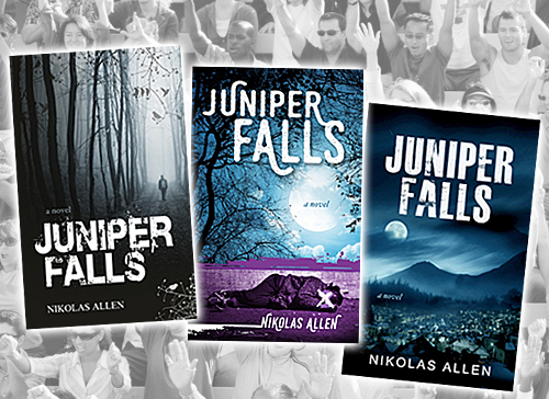
I posted three designs to Facebook (without mentioning that I designed one of them). The feedback was grand. There was a clear winner, a close runner-up, and waaaaaay back at the starting gate, my “perfect” design sat all by its lonesome with two measly votes.
The tribe had spoken: 65% of the people polled would pick up (or click on) one design over the others if they came across its cover.
So, did I ignore the clear message the public was sending? Did I get defensive and try to explain all the reasons why people should have chosen MY awesome design? Did I shake my fist at the heavens and berate all those ignorant fools who “just didn’t get my work”?
Nope.
I emailed the creator of the most popular cover and congratulated him on his winning design, which will grace the front of my debut novel when it drops next year. Lesson learned.
As artists, there are plenty of creative decisions we need to make on our own. That’s what gives us our own unique voice. However, I believe that soliciting opinions and feedback from our audience can often help us elevate our craft. It also demonstrates trust, helps forge connections, and allows your audience to feel invested in your work.
Plus, when you know what resonates best with your audience, you’re better prepared to provide it for them. And that’s just good business.
Is there any aspect of your art business that might benefit from crowdsourcing?
 Nikolas Allen is a contemporary Pop artist, author, and marketing specialist. He has published two marketing books, “Death to the Starving Artist,” and “Heavyweight Marketing,” and is currently writing his debut novel. To learn more, visit NikolasAllen.com
.


You can’t tease us like that and *not* tell us which was the winning design and which was yours. I want to know which one was my favorite 🙂
And I have had similar experiences in many different arenas where I think “this is clearly the [insert adjective]” only to discover my taste/viewpoint is quite “eccentric” compared to the general populace. Which can be a problem for a creative person if one is not independently wealthy…!
Donia ~ I considered adding that info to the post, but figured those interested would ask – so thanks for asking. The winning design was the one on the left: “Man Walking in Woods.” It exudes a mysterious, creepy & slightly ominous vibe that intrigued people.
My design is in the middle. Since I know that a few deaths take place in the story (my voters didn’t), I represented death on the cover. Turns out it was too literal, and people don’t want to “see” death on the cover – even if occurs in the story.
Glad to hear you’ve had similar experiences. I still believe creative eccentricity is a good thing, but often the sweet spot lies between what you want and what “they” want.
Thanks for sharing. Very interesting. My favorite was the winning design, and least favorite (sorry) was yours. I guess that’s just more confirmation all types will pick up your book! 😉
Another reason I was curious is because two of the title fonts used are strikingly similar and I was curious if you “riffed” on one you liked, so to speak, or if the designers came upon the independently… which apparently they did. Fascinating. Thanks again for sharing!
Haha, that’s okay ~ it’s actually good news! Yet another vote for the winning design, which reaffirms my choice 🙂
Yes, all the designers (myself included) apparently felt that a grunge font was that proper choice for this project. One quick tidbit: I prefer the font used in design #3, so I purchased both files from the designers and changed the #1 grunge font to the #3 grunge font. Feels a little cleaner, and more legible. Anyway, thanks for playing!
To your success, Nikolas
How funny that I should find this now. A few weeks ago I had my first solo art exhibition. I’ve curated and participated in many group shows. I was WAY overdue for a solo show. It was a great show with many visitors. I did something different, I had people vote for their favorite painting. Much to my surprise the winner (s) were not what I expected. The event did other things for me as well. It gave me a rough estimate on how many people came to the show. It engaged people! My brilliant sister in law also steered people to sign up to receive the news on who the winner was. Most often people may visit but will not give out their addresses. This gave me a mailing list!! Brilliant just BRILLIANT! Crowd sourcing in a different way. Thanks for your article, which I found on Twitter btw.
Elizabeth, congratulations on your first solo exhibition! Sounds like you employed several great strategies for creating buzz, tracking visits AND building your list. In that regard alone, I’d say your show was a success. Well done! Glad you found this article and that it resonated with your own experience. Keep up the great work, and thanks for your comment!
Nice work Nik! I agree 100% on the version that was deemed the winner. Glad to hear that you were able to overcome the desire to disregard a clear signal – looking forward to the book!
Chris, fancy meeting you here! Glad to hear you’re also in the preponderance of people who preferred the winning design. Yes, I’ve pursued my own vision many times throughout my career, to varying degrees of success. But I’ve also learned the value of listening to outside opinions. Especially when it’s a clear majority. Thanks for chiming in!
Really helpful for me and insightful, I will be using these tips in business. thank you!
Spooky stuff. Before I read your piece, I also chose the winning design as my favorite and put the middle cover in my mental wastebasket (It was too cluttered).
Congrats on your newest endeavor! You are a bright light.