by guest blogger Pete Dunn
Displaying your art to an audience is in many ways the culmination of the creative process. It’s also one of the most important art sales opportunities – a prime chance for people to fall in love with your work.

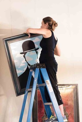
Photo credit: Blueprint 22
You can showcase your work effectively and help love blossom with some basic techniques for creating attractive, engaging visual displays, that can be used whether you’re showing at an open studio, gallery, café, or other venue.
Step 1: Think Strategically
Start by considering who will be looking at your display, and the environment they’ll see it in:
- Will the venue be busy? Quiet? Formal? Casual?
- Will people primarily be there to look at art, or for some other reason?
- Will other exhibits and/or activities be competing for attention?
This information will help you craft a display strategy that supports your artistic mission in that specific time and place. If you’re fortunate, you’ll have the walls to yourself and a focused audience, but it can also be fun to attract passersby at a fair or festival.
Whatever the case, the goal is the same: capture initial interest with a strong, intriguing visual statement; induce viewers to approach and engage; and then deepen the connection.
One good planning exercise is to visualize walking into the exhibition venue as a visitor. What strikes you as you enter? What’s the mood like? And especially, what’s the first encounter with your work – how far away is it, what angle are you coming from, what visual competition is there? Knowing this, you can start to think about eye-catching tactics.

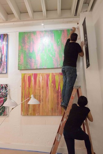
Photo credit: Blueprint 22
Step 2: Develop the First Impression
Establishing a “billboard” for your display is usually a good starting point, especially when you need to draw viewers from a distance or stand out in a crowd. You’ll often see this approach used at the entry to special museum shows, where a work that’s distinctive, immediately appealing, and representative of the collection is set off with plenty of surrounding space, extra lighting, and other visual cues, like a backdrop or lettering on the wall. This is great with larger pieces, but can also be effective with medium-sized works.
Another possibility, especially if your work is on the smaller side, or sight lines are shorter, is to use a pair, trio or quartet of works as your entry point. Well-chosen combinations of images can be greater than the sum of their parts, and there are many options for arranging them, including rows, columns, grids and triptychs.
Experiment with selections and arrangements, to be sure they’re mutually reinforcing and that the unified effect is visible from a distance. Straight and well-aligned hanging is especially important (an art hanging system can be helpful). And if the venue will be crowded, hang your works higher than usual to make them more visible.
Your display should also provide viewers with at least one “next step” that eases them into further engagement. Try flanking the central work (at a respectful distance) with a couple of your other strongest pieces.
It’s generally best when these relate to the central work, especially if space is limited. The more real estate you have, the more opportunities there are to introduce additional themes that appeal to different tastes – but always strive for a unified statement.
Step 3: Cultivate the Connection
The unified statement is important because the best art displays usher the viewer into a different mental space, creating a mood that embodies the underlying sensibility of the art and artist. This sense of immersion can be powerfully appealing, and visitors who like your approach will linger, savor and start to envision having your work as part of their lives.
Hard rules for achieving this are tough to formulate; use your own creative intelligence, and test your ideas with friends and colleagues. But be especially aware that overcrowding is a common problem that will undermine your message – when the eye sees too many images in too little space, the brain lumps them together, and the individual works are lost. Likewise, long uniform rows can also blur together. Instead, create clusters of related pieces and leave space between.
A short, well-crafted artist’s statement on the wall and brief explanatory notes about individual works or groups can also help build the connection. Printing them on clear transparency film sheets is an easy and economical way to get a gallery-type look.
Placing fewer, stronger works on the wall can also give the visitor an appetite for more. Meet it by having additional works in portfolios or bins, and a chair or two on hand – this encourages people to browse and enjoy the mood. And if they’re doing that, you’ll know you’ve got a successful display.
Guest contributor Pete Dunn is director of marketing for Gallery System Art Displays, which supplies art hanging systems to thousands of galleries and other exhibition venues. He is the son and husband of visual artists, which has provided him with hands-on display experience.


In reading the article I noticed a photograph of someone lifting a large framed painting by the top. Caution! Based on my experience hanging exhibits, I don’t recommend lifting any painting from the top of the frame. Doing so stresses the frame, and may result in separating the top of the frame from the art and glazing. Instead, lift a framed painting from the sides. If possible hang paintings using two people on either side, one hand on the side of the frame and the other supporting the bottom of the frame. In carrying a frame, lift from the wire, with the glass side toward the body.
Hey Nick,
Great points all around – you clearly have a lot of relevant experience in this area, and your comments make the article more valuable. You’re so right about using the wire for carrying; it is, after all, the one part of the framed work that’s designed specifically to carry weight.
In the heat of trying to get an exhibition in place by a deadline it’s easy to let proper handling procedures slip. But this is a perfect example of the old saying “go slow to go fast.” Taking the time to do it right helps avoid creating new problems.
Thanks for sharing your knowledge!