by Carolyn Edlund
Many artists want to capture a piece of the online market. Use these strategies to provide a compelling customer experience that leads to the sale.

Artists have lots of different options to sell their work online. They may choose to sell through a third-party platform, such as online gallery, marketplace, or auction site. Or, they may sell directly from their own website. Many artists do both.
The value of having your own art website is that you alone are in control. You can’t be closed down by the “landlord” who owns a third-party platform. There won’t be links on the page that draw visitors away to look at someone else’s art. And, you can publish a completely custom website with all the bells and whistles, or use a DIY template from providers (find them in our directory of places to sell online.) The choice is yours.
Regardless of how or where you build your art website, you will want it to function well and produce sales. In order to do so, your site must show your art to its best advantage, connect with your audience, earn their trust, and move them towards making a purchase. Here’s your checklist of essentials:
Excellent images, and lots of them
As a visual artist, you know the importance of representing your art beautifully. But it’s surprising how many artists actually use poorly taken photographs of their work online. They may not have the budget for professional photography, or they lack the skills to do it themselves, but settling for mediocre images is a mistake. Shots that are overexposed, blurry or have inappropriate backgrounds look terrible, and they reflect badly on you as the artist. When shoppers have no way to see your work except through photos, make sure they see the best you have to offer.
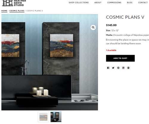
Photographs that can be used on an art website include product shots, detail photos, in situ photos, and even work in progress shots. Each one gives vital information that enhances the shopping experience and gives the viewer a clear idea of what your art is all about, and why they might want to become a collector.

Plenty of information
Providing information to shoppers is fundamental to the sales process. If your work is for sale, list a price for each available item. Give the title, medium and technique, dimensions of the art and more. Share your inspiration, and why you created it.
Let your visitors know you are a complete professional. A CV, your artist statement and list of exhibitions on your About page helps to establish credibility and authority, and fosters trust. You must also understand how your art and your story resonates with collectors. Make that connection by speaking directly to them in your written content. Yes, your website is about you and it’s about your art, but it is also very much about the site visitor and what they care about.
You may want to include selling points on your website. These reasons to buy, also called “features and benefits” are sales basics. Is your work handmade in America? Does it make the perfect gift? You may list emotional benefits of living with fine art, or share how becoming an art collector is something to celebrate.
Your site must also address practical matters. How is your artwork shipped? What are the costs and turnaround time? Do you take returns? Do you accept commissions? All of these answers and more are very important to anyone considering a purchase. If you don’t tell your customers what they need to know, they simply won’t buy. An FAQ page is the place for this information.
And, make it easy to get in touch with you by listing your email and phone number on your Contact page (or even in the header of your site.) Most artists would be happy to take a call from a serious prospective customer.
Easy functionality
To convert prospects into collectors, it’s best to make shopping and checkout a simple, seamless experience. The navigation bar on your site should be intuitive and easy to use. Product level pages should have images and descriptions that draw in the viewer, and give complete visual information. If you offer choices, such as different sizes of giclees or framing options, keep them finite and don’t overwhelm the customer. If your shopping cart needs an upgrade, visit any major ecommerce website for ideas on the checkout process and how you can improve it on your own art website.
Marketing follow up
Most people aren’t going to make a purchase they first time they see your work; that’s just a reality of sales. It takes time to cultivate collectors, which means you must stay in touch them on a regular basis. Use a subscriber opt-in form on your website to gather the names of visitors who are interested and want to learn more. Then, send monthly email campaigns that consistently share your story, show your artwork, and drive the reader back to your website for additional visits. Over time, you will close sales from shoppers who come to know and remember your work. When they are ready to buy, your site will be a go-to destination for their artwork purchase.
Successfully selling art online is the culmination of a lot of hard work and attention to detail. Understanding the elements that customers need in order to make buying decisions is key to building a site that offers an enhanced shopping experience and more sales.
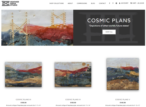
Artist website credit: www.HeatherDavis.com

Speak Your Mind