by guest blogger Sandi Dettman
Having a website is one of the primary marketing channels available to artists. If you are considering adding a way for collectors to buy directly from your website, you are not alone.
Did you know that, according to the Hiscox Art Trade Report, art sales worldwide have more than tripled in the last five years? This trend is expected to grow. Collectors are becoming more comfortable purchasing art online, and getting direct sales from your website is a real possibility. Regardless of how you add e-commerce functionality to your website, here are 12 critical elements you need to include on your shopping cart or product pages. Each will help you establish the trust a collector needs to purchase your art online.
1. Make Your Website Secure with a Sitewide Secure SSL
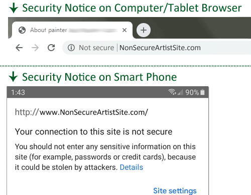
One of the most obvious ways to establish trust and gain the confidence of a potential collector is to have your entire site protected by a Secure SSL. Most website and phone browsers alert users when a website is not secure. A prominently displayed “NOT SECURE” notice is no way to start a relationship with a visitor. It’s likely to send them packing before they navigate past your home page.
2. Have a Mobile Friendly Website
In 2019, 49% of all internet traffic came from mobile devices, and more than 40% of all e-commerce purchases were made on a phone. With these numbers expected to increase, having an easy to navigate, mobile friendly website is a must. Most e-commerce platforms and website providers offer designs which look great and function well on a mobile device. If your site isn’t mobile friendly, check with your designer or provider for an upgrade.
3. You Must Have Good Photos
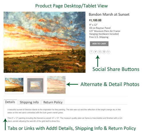
Having good photos of your art is the most important thing on your website, and your product page is no different. Ideally your product page should have the largest size images you are going to offer, not a small image that looks like an afterthought. You should also consider including close-up details of a work or several alternate views, especially of three-dimensional pieces. Check your platform or theme to see what the recommended size is. 800px x 800px is the suggested minimum in WooCommerce, but using a larger image will allow it to zoom and give your potential collector a good idea of what they are buying. A great website is not just about using good quality photos but also creative designs too. If you’re not good at graphic design, there are options such as one of the many creative graphic design subscription services available.
4. Include the Title of Each Piece
Best practice is to use the title of your work as a H1 (heading 1) tag. This will help your collector remember pieces if they are viewing multiple works, and can give you an SEO boost in the search engines as well.
5. Include the Price
Whether you include prices of your works in your gallery or slideshow views or not, you definitely need to list the price of each item for sale on product pages.
6. Use a Meaningful SKU Number
All e-commerce platforms allow you to enter a SKU number when adding a product. Some require this, while others make it optional. Best practice is to use a SKU number that will identify the piece for your records. This will help with inventory, sales reports and shipping the correct work.
7. Include the Dimensions
Every collector wants to know what size your piece is. If you are selling two-dimensional art, list it in inches as Height x Width. Descriptions of three-dimensional pieces should also use the H x W format, but you may want to include other dimensions such as depth, length or even the weight if appropriate.
8. Add a Good Description
At a minimum, you should include the medium used and the type of substrate the work is on, such as “oil on linen”, “acrylic on canvas”, etc. For three-dimensional pieces, identify the material the piece is made of, e.g. clay, bronze, stainless steel, resin, and even what the base is made of, if applicable.
9. Use a Call to Action Buy Button
Regardless of the e-commerce platform, or if you are just using PayPal, the buy button should be easily identified and have a clear call to action such as “Buy Now” or “Add to Cart”.
10. Provide Shipping & Insurance Information
By adding shipping information to your product pages, you will gain the confidence of your potential collector and make them more comfortable with a purchase. You will want to include the shipping method, indicate who pays for shipping, and if appropriate, the cost. Just as important is to include information on insurance, noting if a signature is required for delivery, and a time frame to ship the piece.
11. Include a Return Policy
No one wants to sell a piece only to have it returned. You may think, “Why even bring it up?” However, letting a customer know they can return a piece and how to do so is essential when selling online. Because they are buying something they cannot see or touch, a buyer will want to be reassured that if the piece isn’t what they had hoped for or doesn’t fit in a particular space, they are not stuck with it. Transparency on this subject is essential.
12. Make it Easy to Share by Adding Social Share Buttons
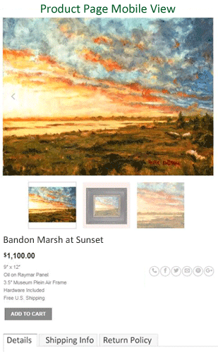
Most website templates have an area in the header or footer of the site with links to your Instagram, Facebook, LinkedIn and Twitter pages. This, however, is not what I am referring to. “Social Share Buttons” live in the main content area, link to a specific page in your site and should be on every one of your product pages. These buttons make it easy for a someone to share your work with others who may be interested in purchasing it, such as a spouse, friend or colleague. Don’t frustrate someone who wants to share your art, especially if they are viewing it on a phone.
Several options for adding social share buttons to your product pages are AddThis.com, ShareThis.com, and AddToAny.com. They are all free and integrate with WordPress and a variety of other e-commerce platforms.
By taking the time and energy to add e-commerce functionality to your artist website, you can take advantage of the growing number of collectors purchasing art online. Make sure you have great photos, an easy to navigate, and a mobile friendly site. And, include these 12 essentials on your product or shopping cart pages. Doing so will give you the best chance of gaining the confidence and trust of a buyer and earning a sale.
Sandi Dettman is a principal and webmaster at ArtistGifts.com, a website featuring gifts for artists since 2001. She has worked as a web designer and SEO specialist since the early 2000’s and enjoys creating art and designing jewelry.

Speak Your Mind