Mauricio Perry uses digital art and photography to explore the world of Shodo, the traditional Japanese art of calligraphy. See more of his portfolio on his website.
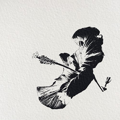
“Shodo 0157c” photography/digital art, 12″ x 12″
In the traditional Japanese art of calligraphy (Shodo), the ideogram conveys not only the meaning of the word or concept and the Zen concepts they are associated with, but also the personality and energy of the Shodo practitioner.
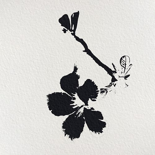
“Shodo 4723″ photography/digital art, 12″ x 12”
The aesthetic qualities of the shodo ideograms, usually deep black and grey contrasting over very white paper (washi), carry for me the emotional charge of the purity and restrained simplicity of the lack of color.
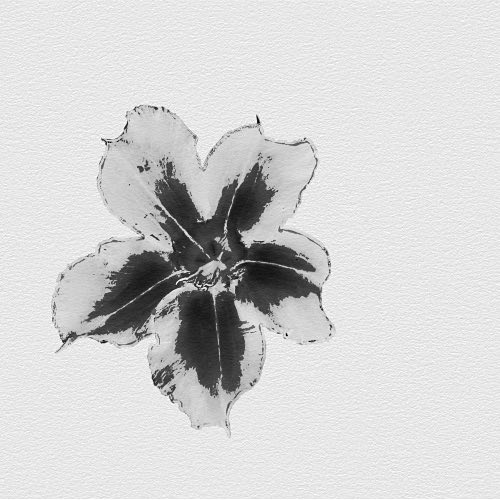
“Shodo 183026e” photography/digital art, 12″ x 12″
To accentuate this simplicity, I deliberately choose not to include the traditional red signature stamp (inkan) of my name. The ability to create a work of art with economy of resources adds to the aesthetic value of the work and challenges me as its creator.
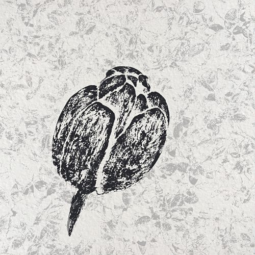
“Shodo 161732c” photography/digital art, 12″ x 12″
As a self-taught photographer, my intention is to create a painterly image based on a digital photo.
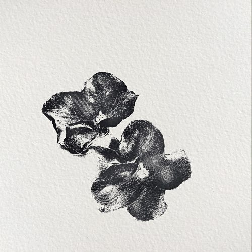
“Shodo 5245″ photography/digital art, 12″ x 12”
Many times, I find a trivial image, an everyday object or scene, to which most people often do not pay attention. However, my “eye” allows me to discover the expressive possibilities of the image with the help of digital tools.
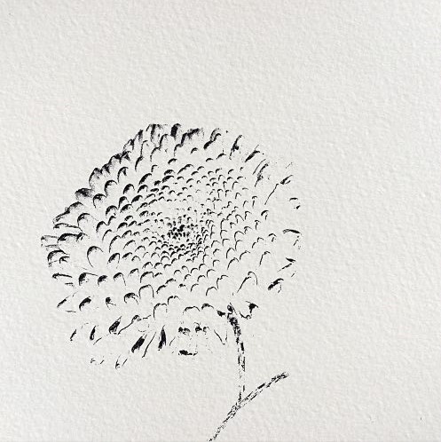
“Shodo 5326″ photography/digital art, 12″ x 12”
The results are usually unexpected—contrasts, lines and backgrounds that help define what in Japan used to be called a “floating world.”
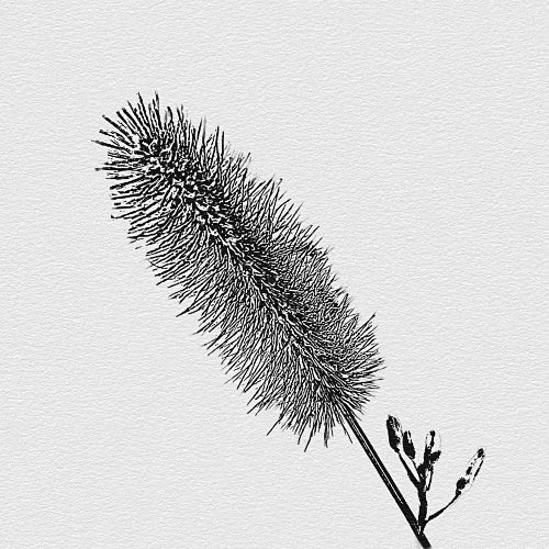
“Shodo 92518″ photography/digital art, 12″ x 12”
The visual product is the well-balanced result of the selection of the image to be photographed, the choice of the subject within the photo and the manipulation of the foreground and background. Sometimes the result is ambiguous, sometimes it is intriguing but it is always—in my opinion—pleasing to the eye and usually conveys a sense of serenity and inner peace.
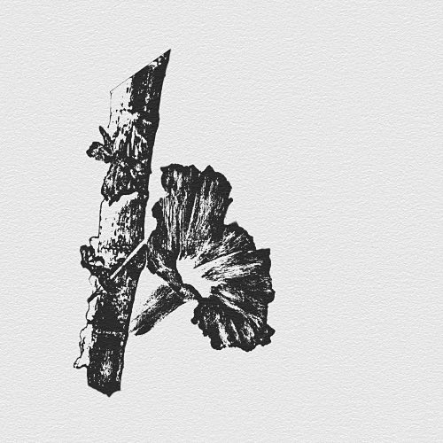
“Shodo 2595″ photography/digital art, 12″ x 12”
Creating an image for the Shodo series is an exercise in experimentation. I crop (usually to a square format), darken some areas, lighten others, choose the adequate background and decide if the subject will cast a shadow or not. All these apparently inconsequential choices add up to create an image that satisfies my desire for self-expression.
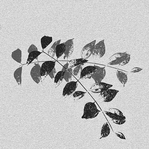
“Shodo 7548c” photography/digital art, 12″ x 12″
The end result is an image that has been stripped of any unnecessary elements to convey the essence of the represented object. Once the image is printed, I usually place it in an austere black frame with a white mat to match the feeling of the work.
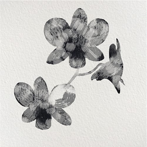
“Shodo 0940″ photography/digital art, 12″ x 12”
In my journey, I have incorporated teachings and ideas from other artists and masters, notably Silvia Brewda, Jack Wild and Simon Foster. I am grateful to many others—some contemporary, some from centuries past—that, knowingly or not, provided inspiration and guidance or both.
Artist Mauricio Perry invites you to follow him on Instagram.

Mauricio,
Your photos look like graphic images of nature. I used to do ink drawings that really breaks down each detail of the image you are portraying.