by Carolyn Edlund
The better the presentation in your show booth, the more your artwork will appeal to your audience. Use these tips to create a compelling display.

Retailing is all about presentation. You have mere seconds to make an impression to attendees at fairs and festivals. Put your best foot forward by creating an inviting display and a level of excitement that draws in shoppers.
Avoid Clutter
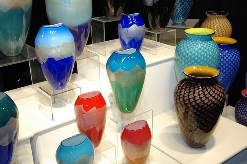
Give each piece in your display some “breathing room” to let it shine as a special work that deserves attention. When products are merchandised in a cluttered way, they tend to look more like commodity items, and thus less valuable and less desirable. Art galleries use this method to establish an upscale shopping space that commands higher prices.
Play up the Lighting
Display lighting is one of the most important elements needed to create a dramatic presentation. Your customers need to see your work clearly, and a well-lit display will provide that. But lighting also sets a mood, and can highlight particular items that you want to promote (your bestsellers, perhaps?) A booth that is bright and welcoming tends to pull in more shoppers.
Make a Splash with a Showpiece
Do you have a spectacular piece of high-end work that is perfect as the center of attention? Create a display using it as the star, but with lower-end items around it. That showpiece may not sell, but it will serve to create a buzz, show your artistic abilities, and sell the lesser expensive items that might fit shoppers’ pocketbooks better, in the same display. This is a common strategy used in retail stores, and it works.
Use Odd Numbers and Multiples
Set up your display using an odd number in groupings. Three pieces grouped together is the “magic number” that keeps the eye moving (while even numbers tend to be less interesting in displays.) A row of similar items will also stand out as it creates a visual synergy. If you have a collection of work that looks great together, show it together and you may sell the set.
Eye Level is “Buy Level”
Store managers know that eye level is the best placement for selling products. Vendors fight for that type of placement in grocery stores because that’s where the most sales are made. You can take advantage of this strategy as well. Place your bestselling merchandise right in front of your customers’ eyes; don’t make them bend over or stretch to see what you have displayed on a low table or up high. Make your work easy to see and customers will respond.
Encourage Handling
When a potential customer picks up an item they are considering, it is “three-quarters sold”. This means that you should make your work accessible and touchable. If you are selling smaller, expensive goods that could be stolen, or very fragile items, replace this will excellent customer service where you present the work to a shopper and carefully place it in their hand during the sales conversation.
Your display is only part of the equation. A great artist story, plenty of information for the shopper and good selling skills are also helpful, but often the way you present your work is the first visual clue to customers that you have something exceptional for them to consider.


Beautiful. These would look great on Scandinavian tables and shelves! Anything MCM!!
Very true! Thanks for your comment.