By Carolyn Edlund
Whether you exhibit your work at trade shows, or just want to publicize your collection, you need a press kit that works.
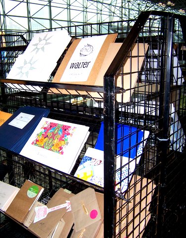
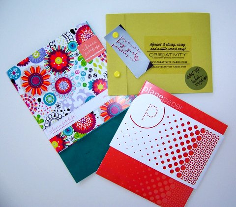
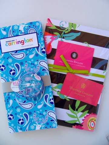
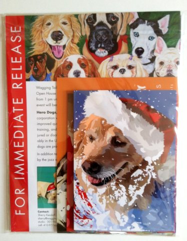
When attending a trade show, it’s an advantage to prepare kits for the Press Room, such as these seen recently at the National Stationery Show in New York.
Only about 10% of exhibitors create press kits. Ignoring this potential for publicity in the press is a huge mistake. After all, you pay thousands of dollars for a show booth. Why would you throw this opportunity away?
Press rooms are often crowded with reporters, bloggers and freelancers looking for something exciting to write about, and they look to press kits for inspiration. So, what are they looking for?
Beth Dugan of Giftware News says, “What grabs my attention is lots of color and unusual materials. Make your art pop out – it shows what is inside the kit.”
Another freelance reporter busy perusing press kits added that she likes kits that are small and portable, preferably with clear covers. She also likes kits that are easy to open. “Use a bribe,” she suggested, “Even a small piece of candy or pencil, or an invitation to pick up a small gift at your booth. It works.”
Avoid making these mistakes with your press kit:
Too heavy. Nobody likes to drag around a ton of paper. One lovely press kit had a big green bow and beautiful paper, but contained a full catalog inside. It weighed several pounds – and got left behind.
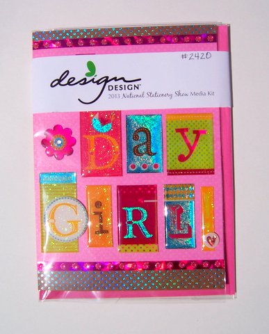
Too plain. Is your press kit inside a brown envelope or solid color folder? Forget it. The press kits that got praised jumped out from the rack. Design Design’s kit gets major points for being simple but effective. It contained one colorful birthday card in a plastic cover, with a CD of their catalog tucked behind, and their booth number prominently written on the front.
Too wordy. Reporters say they want visuals – not thousands of words about you, your company, etc. that they don’t have time to read. Make it short, using bullet points, varied fonts and even story ideas, which tell how your collection can fit into different article topics.
Simple. Portable. Visual. Inviting. This makes a press kit get picked up, and kept. Take a good look at the press kit you’ve been using and make any revisions you need to grab press attention and get publicity.

Hello Carolyn
Once again you have hit the mark with a great post. You are so right, nothing shows off an artist or designer better than a press kit.
thanks again,
MaryJane
Thanks, MaryJane. I will admit I had a lot of fun looking through them all!
yes thank you i would never have thought about creating a press kit if you kind people hadn’t imparted your invaluable ideas and knowledge. They all look lovely especially the one with the dog on the front sporting a festive hat
Joanne
Thanks, Artsy! It’s a great reminder.
Great ideas! Thank you so much!
I guess I never really thought about how to stand out of the crowd with doing things to make such a nice press kit! I appreciate the sharing of this! Thanks!
Robert, now you’re ready – go forth and get some press!
Hi Carolyn!
This was awesome and super helpful.
Do you have an estimate for how many kits we should have ready?
Thanks so much!
Niki
Nicole, It’s hard to say for any given event, but I would plan to have at least 12-20 press kits if you do a big trade show.