Jennifer Rapp Peterson
Guest blogger Jennifer Rapp Peterson is the founder of IndieMade, and an expert on artist websites. She shares insights from years of advising artist clients on website building.
We all know how important it is for an artist to have your own artist website: an artist who sells work or services for money is a business, and every business needs a website. It is often the only “real estate” an artist owns, after all, and often serves as an introduction to a new audience. Getting an awesome website is easy — as long as you avoid these common mistakes artists make:
1. They don’t set a goal.
To deem any project a success, it’s imperative to have a clear definition of “success.” What are your goals for yourself? What is the goal of your website? Is it to showcase your work? To find or grow an audience? To sell your work from your website? If so, to what end? Keep asking why until you can’t anymore.
2. They skimp on (or skip) the research.
Investing in a website is like investing in anything else. It is best done with research. Just because Joe down the street used _________ to build his website, doesn’t mean it will be right for you.
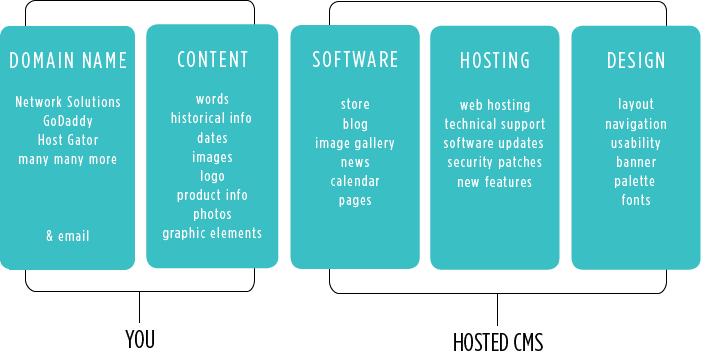
Having a grasp of what components go into building a website will save you from the “gotchas”:
I see many artists deciding to move forward only to find out later that a certain feature is only offered as an add-on at additional cost.
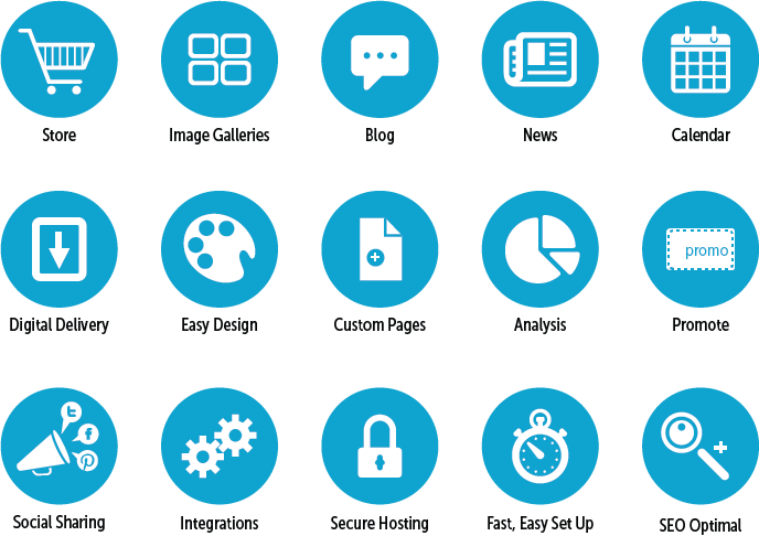
If you’ve identified the software features you need now (and in the future) will save you headaches down the road. For instance, in order for search engines to drive an audience to your website, you need to regularly add fresh, SEO-friendly content on your website. So along with image portfolios, or a store, you might want to include a blog and/or calendar too.
3. They don’t use a CMS (Content Management System*)
I am still surprised that so many still design and code their own websites from scratch. No one needs to learn how to code to get a website done affordably these days. It is a waste of money to hire software developers to program a website from scratch.
4.They haven’t considered their audience.
A good website caters to its target audience. It’s also important to have your target audience in mind when planning your website’s design and architecture. Who buys your artwork now? Who might buy your artwork? Why do they buy your artwork? What are the demographics? What are the most important factors when designing a website for them to use?
5. They make information difficult to find.
Visitors shouldn’t have to hunt to find what they’re looking for. Your work and contact information should be easy to find, and you should have a working contact form. Be sure to edit yourself! Having too much information on your site makes what’s relevant more difficult to find. Not having consistent navigation will hurt you too. When it’s hard to move from section to section or image to image, it decreases the amount of time a visitor stays on your website.
6. They don’t put all of their content on their website.
Using multiple websites to do the work of one well built website is a losing proposition. Separating your blog from your store from you online portfolio is confusing to both visitors and search engines. Your content is easy to find if it’s on one website.
7. They overdesign.
Your website is not your artwork (unless it is what you do). Your website is a well-designed tool to market your artwork. Keep it simple! Using too much color and flashy graphics can completely distract a buyer and overpower the artwork on your website. Neutral but elegant websites allow artwork to stand out. Be sure to have some real content on your website, especially your images, before making any final design decisions. And please don’t force people to listen to audio. It is quite possibly the quickest way to turn people off – especially those browsing in a quiet, public space.
8. They haven’t invested in photography.
Sure, you know what your work looks like — but your visitors don’t. Don’t let them fill in the blanks on their own. It is quite simply imperative to have good photography of your art. Whether you hire a professional or learn enough to do it yourself, your images must stand out.
9. They are unfriendly to search engines.
Having very little to no text on a website is a big no-no these days. Even websites of visual artists need text. Search engines still work mostly in text, so pay attention to it on your site. Include alt tags or captions for all of your images so search engines can “read” your images. Be sure your website’s architecture is optimized for search. Your search engine rankings will increase with a regular injection of fresh, relevant content.
10. They think they’re done after the website launches.
Just as static gardens die without attention, so do static websites. Contrary to what you might see in advertising, websites require work to attract and keep an audience. Once you understand how to edit and add content to your website, develop a plan for regularly adding relevant content. Promote your content through on social networks. (And, of course, continue to market your business offline too.)
Your website should be as energetic as a living breathing thing. There will always be something to add, change or remove. With enough attention, you can turn your website into a marketing machine.


I’m in the process of setting up my website and this has been a very useful set of pointers to “get it right”. Many thanks
Don
Thanks so much Donald! I am glad you found some useful tips.
Some brilliant pointers there Jennifer, thank you for sharing. I’ve also found that many artists websites go out of their way to make it difficult for visitors to share their content with their followers, and in todays “Socially Connected” world it’s really important – as is making your site mobile friendly. I’ve written an article on my blog to help artists, art galleries, art suppliers and art publishers with social media and social sharing here: http://watercolourjourney.com/6-social-media-tips-for-the-art-world/ Hope this helps 🙂
Ian
I share your opinion on 9.5 of those 10 mistakes Jennifer and wanted to thank you for it. That mistake that I find debatable -as you formulated it- is not to use a CMS. There are plenty of good and bad reasons for using or not using a CMS. I would agree that doing it all yourself without using a CMS is a waste of time, unless you are a software engineer. But the sentence I would definitely take out is : “It is a waste of money to hire software developers to program a website from scratch”. I can bake good bread, but I do buy my bread in the bakery. It just makes sense.
Hi Oliver & Ian, sorry for my late response!
Ian – I agree! Thanks for posting your tips.
Oliver – Thanks for your comments. Whether it’s worth coding a website from scratch for thousands of dollars or using a CMS is a personal decision for sure.
The single biggest mistake I see on nearly every artist website is how they categorize their work, usually by a generically named “Portfolio 1” “Portfolio 2”, for example. Or else the work is grouped by set of years.
Neither of these organization schemes helps the user. Instead, it forces the user to go through the entire portfolio to find something they like. Most will give up, because another problem is poorly optimized images that load slowly.
I think there’s a reason for this. As an artist produces more work, eventually there’s too much, so they arbitrarily assign groupings to keep it all contained.
It does take a lot more work to think about how other people see your work. Or how other people search. Better organization schemes might be by color, by technique, by size, by subject matter, or a blend.
Once you give meaningful categories or tags to work, you can put to use one of the many portfolio plugins that will sort work when the user clicks on a particular category. And one piece of work can fall under more than one category.
Excellent suggestion, Jane! I totally agree that meaningful categories or named collections are the way to go. Keep your website customer-focused. What are they looking for? What would be helpful to the website visitor?
Well said, Jane. I totally agree. Arbitrary categorization helps no one.
It’s all about the mission of your website. Is it to secure a job in academia? Is it to sell your artwork directly to consumers? Are you reaching out to galleries? Is a combination of the above? Each of these audiences (target markets) often require different taxonomies and search terms.
Your target markets’ demographics are very helpful when coming up with categories. In addition, these starter questions may prompt some good ideas:
What materials do you use?
What makes your work special? What separates your work from other artists’?
What terms do they use when they describe your work?
How would your target market search for the kind of work you produce?
How do people purchase from you? Why do they buy your work?
If you do not have clear answers, don’t be afraid to ask your customers and peers. It’s important to listen objectively – their answers may surprise you.
A quality website builder (CMS), like IndieMade, can help tremendously. The CMS should 1) include an integrated image gallery/portfolio feature, giving an artist the ability to apply multiple categories and sub categories to accommodate every type of website visitor (no plug ins required) AND 2) automatically optimize (resize) images for for quick loading (no manual optimization of images required).
I wrote an e-book that can be downloaded for free, if you sign up for IndieMade’s mailing list, _How to Build an Artist Website_, http://www.indiemade.com/newsletter which delves more deeply into the topics addressed in this post.
Again, thanks Jane and Carolyn.
Jennifer
Hi, Thanks for the great advice…but… I keep procrastinating on which site is best for me. I am a visual aretist who also creates video art, animation as well as 2D ART…just can’t decide. So many out there.
Ron, Check out our directory of places to sell your art online here https://www.artsyshark.com/125-places-to-sell/ which contains a list, description and links to potential platforms. It’s free to use.
Great info, what site did I see Artstorefronts… not sure but I believe Carolyn Edlund of Artsy Shark used it and many testimonies were fascinating. Help,..:who was that?
Yes, Vicki, I do endorse Art Storefronts because they have a great platform for artists to build their websites. It’s more expensive than some other platforms, but they have outstanding features that can help you make your best presentation.