by Carolyn Edlund
Art fairs and festivals can be challenging when it comes to display. Here’s how three artists transform their booths to present their work effectively and draw in customers.

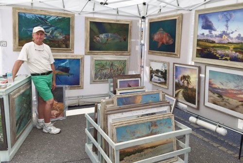
Artist Keith Martin Johns in his art show booth
Many factors can make setting up a booth display difficult, especially when the show is outdoors. Weather, uneven ground and being able to only use natural light are some of them. A recent visit to the Boca Grande Invitational Art Festival shows how different artists find solutions to overcome the elements and give a welcoming presentation.
Keith Martin Johns
Oil painter Keith Martin Johns uses his double-sized booth to create a compact but effective gallery look. Johns specializes in landscapes and coastal themes which fit this festival perfectly. Hand-built frames with a distressed rustic look tie together the different genres, and he carefully hangs originals and reproductions for a “salon style” effect.
A large bin holds additional works, with enough room to comfortably walk around and view all of his art. A counter holds brochures and business cards and has space to wrap items and make transactions. He has come up with a solution that gives a high-end look to a street fair.

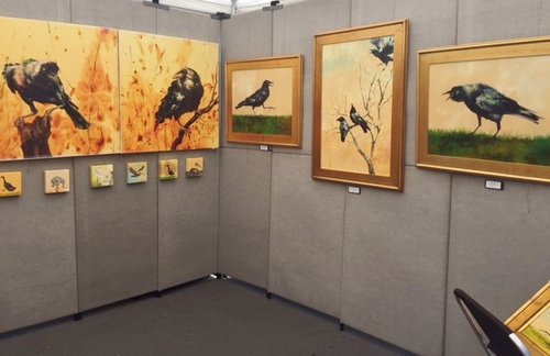
Painter Kate Carney’s booth gives an upscale look
Kate Carney
Artist Kate Carney makes real impact with her booth display at the festival. She uses a Pro-Panel type setup to give an elegant interior look to her outdoor booth. Carney places her work sparingly given the wall space, which accentuates each painting. Metallic gold frames work beautifully with the warm color scheme that draws the eye.
Her back wall features gallery wraps in large and small sizes, offering a price point spread with choices for collectors with different budgets. This booth display works beautifully, with a “wow” factor that attracts plenty of shoppers.

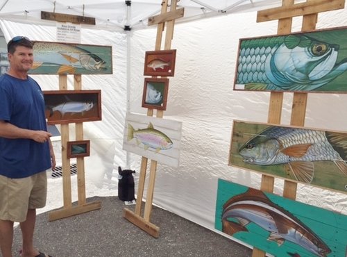
Andrew Dorsett used a simple but effective setup in his outdoor booth
Andrew Dorsett
Florida painter Andrew Dorsett has an unusual booth concept that is minimal, super easy to set up, and makes his paintings the center of attention. He describes his body of work as “rustic fish and wildlife paintings on handmade wood panels” and at this festival, he presents gamefish images that coincide with the annual tarpon tournament taking place on Boca Grande.
Dorset uses wooden “easels” that echo the substrate of his paintings, and gives his booth display the look of an open studio event. Paintings are grouped for greater impact, but they aren’t overcrowded. He doesn’t strive for an indoor look with his presentation, but the big bold nature of his work and simple presentation invites fairgoers to take a closer look.
Have you found a great solution in your outdoor booth presentation? How have you overcome this challenge?


My paintings run from small, 4″ x “6 to large 2′ x 6′ and I have a lot. At times I think my booth looks too “busy”. Would it be better to not try to display everything I have and spread out more?
Probably so, Denise. Overcrowded displays tend to make work look less valuable – like commodity items. Give each piece of art a little “breathing space” so that it has room to shine. And, if you have inventory in the back, you could pull out some new items when speaking with a customer. Shoppers love to see what’s new, and feel that they have first dibs on that particular work.